

Your team just ran a cold outreach campaign. The open rate hit 47%. Everyone in the Slack channel called it a win. Then you checked the pipeline and found zero meetings booked from it. That is not a win. That is a well-decorated failure. The problem is not that your team tracked the wrong number; it is that they celebrated the wrong number. Cold outreach campaign KPIs only matter when they connect directly to pipeline, and most sales teams are still one or two layers removed from making that connection clearly. This article closes that gap.
The Two Types of Cold Outreach KPIs (and Why Mixing Them Up Kills Your Pipeline)
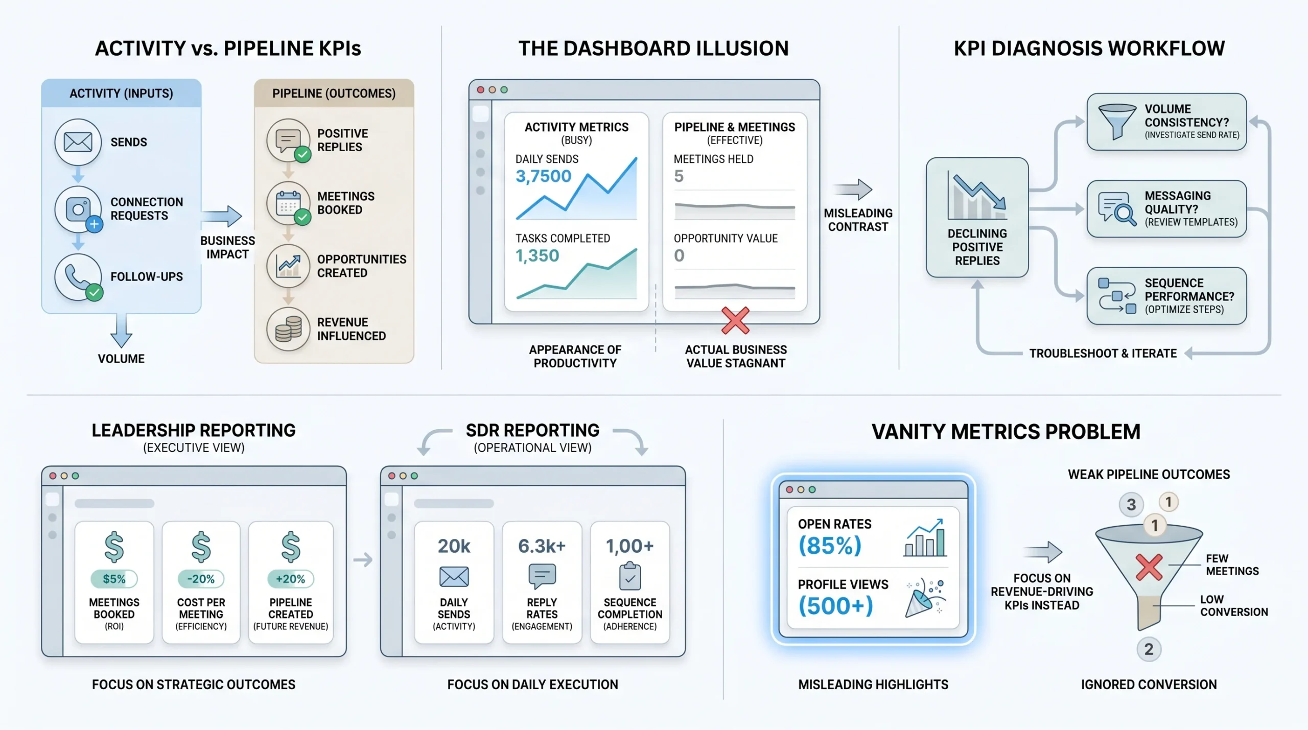
There are two distinct categories of cold outreach campaign KPIs, and most sales teams treat them as interchangeable. They are not. Confusing them is one of the main reasons outreach programs run for months without producing consistent pipeline.
Activity KPIs measure what your team is doing. They count sends, connection requests, follow-up touchpoints, and daily volume per rep or LinkedIn account. These numbers tell you whether your team is showing up to work. They do not tell you whether the work is producing anything useful.
Pipeline KPIs measure what those actions produce. Replies. Positive replies. Meetings booked. Opportunities created. Revenue influenced. These are the numbers that determine whether your outreach program is an asset or an expense.
Here is where things go wrong. A team under pressure to show progress will instinctively report activity KPIs because they are always moving upward. Sends go up. Connection requests go up. Volume goes up. The dashboard looks busy and busy feels productive. The actual pipeline question, which is how many of those sends converted to a conversation worth having, never gets asked clearly.
Activity KPIs have a legitimate role. When a pipeline KPI drops, you use activity KPIs to diagnose why. If positive replies fell by 40% this month, the first thing you check is whether volume held steady. If it did not, the problem is execution, not messaging. If volume held and replies still dropped, the problem is in the sequence itself. That is how activity data should function: as a diagnostic layer underneath the pipeline metrics, not as a reporting goal on its own.
Which KPIs to Report to Leadership vs. Which Ones Stay Internal to the SDR Team
Leadership does not need to know how many connection requests your team sent last week. They need to know how many meetings got booked and what those meetings cost to produce. When you report activity metrics upward, you train leadership to optimize for activity, which produces more activity and not more pipeline.
The internal SDR team needs both layers. They need to know their daily send volume, their sequence completion rates, and their per-account performance because those are the inputs they control. But the conversation between a sales leader and an SDR should always anchor to pipeline output, with activity data used to explain gaps.
A clean split looks like this:
- Leadership reporting: meetings booked, pipeline created, cost per meeting, positive reply rate
- SDR-level reporting: daily volume, connection acceptance rate, reply rate per sequence, sequence completion rate
The Danger of Vanity Metrics at the Board Level
Open rates and LinkedIn profile views are the most frequently reported vanity metrics in outreach reporting decks. Neither one creates revenue. A 60% open rate on a sequence with a 0.5% positive reply rate means your subject line is excellent and your message is not. Reporting the open rate without the downstream number is selective visibility. It is a way of looking busy without being accountable.
Profile views are worse. LinkedIn shows you when someone views your profile after receiving a connection request. Some teams track this as a signal of interest. It is not a KPI. It is a behavior you cannot measure at scale or act on predictably.
When a metric cannot be tied to a specific action that improves pipeline, it does not belong in a reporting framework. Keep it as background data if you want, but do not let it occupy a KPI slot.
The Core Cold Outreach KPI Stack (With Channel-Specific Benchmarks)
Every cold outreach program runs on at least one channel, and most run on two: email and LinkedIn. Each channel has its own performance benchmarks, its own failure patterns, and its own KPI layer. Treating them with the same set of numbers is a mistake that produces misleading averages and bad decisions.
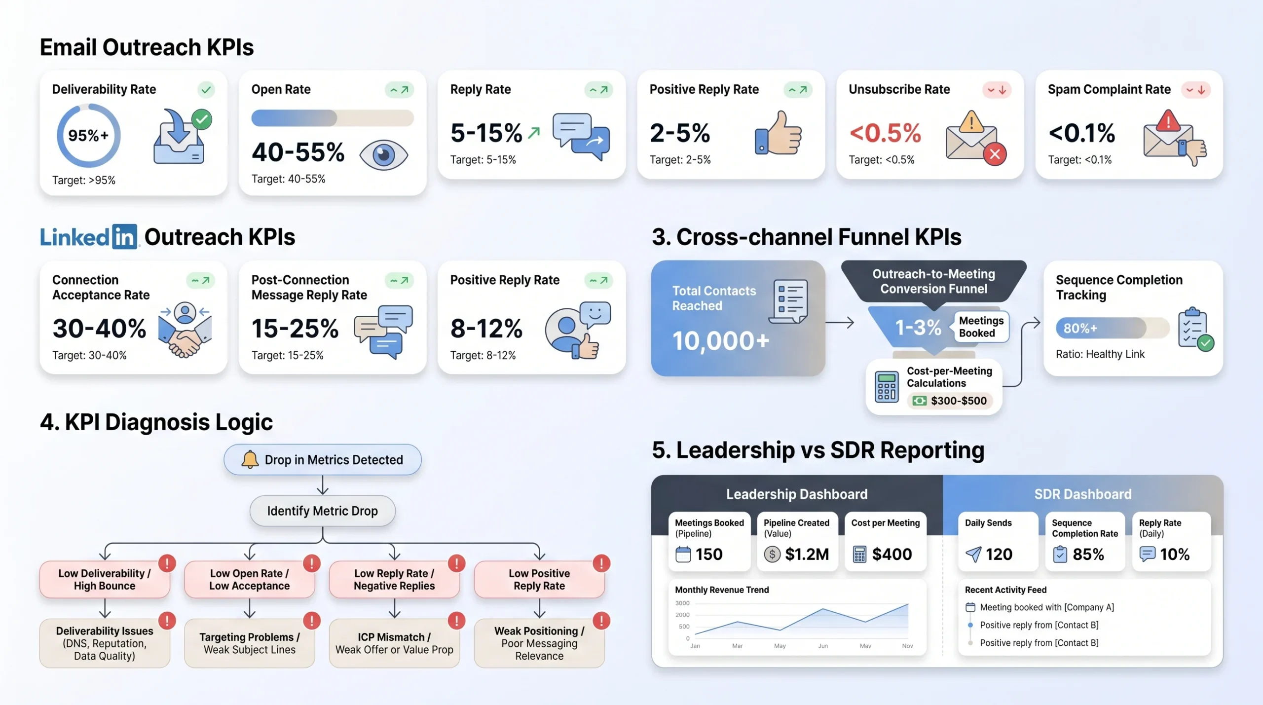
Email Outreach KPIs
Deliverability rate is the percentage of your sent emails that actually reach the recipient’s inbox rather than bouncing or going to spam. The floor for a healthy sending domain is 95%. Below that, you have a technical problem, not a messaging problem. Common causes include sending from a domain that has not been warmed up properly, exceeding daily send limits for a new domain, or accumulating spam complaints from previous campaigns. Tools like Mailreach, Lemwarm, and Instantly’s warm-up feature track deliverability at the domain level and flag problems before they become irreversible.
Open rate is the percentage of delivered emails that recipients opened. For cold email sent from a warmed domain to a clean, targeted list, a realistic benchmark is 40% to 55%. Above 55% usually means your subject line is doing something right for your specific ICP. Below 35% consistently points to a subject line problem, a deliverability issue pushing emails to promotions tabs, or a list that is not well-matched to the sender’s domain identity. Open rate matters as a diagnostic signal, not as a success metric.
Reply rate is the percentage of delivered emails that generated any reply, including negative replies and out-of-office responses. For cold email, a realistic benchmark across B2B verticals is 5% to 15%. Where you land in that range depends on list quality, personalization level, sequence length, and how precisely your offer matches what your ICP cares about right now. Sequences targeting SMB prospects with a clear pain point and a direct offer tend to land at the higher end. Sequences targeting enterprise buyers with a broad pitch tend to sit at the lower end regardless of how good the writing is.
Positive reply rate is the number that actually matters for pipeline. This measures replies that indicate genuine interest: questions about pricing, requests for a demo, expressions of timing interest, or introductions to the right person internally. For cold email, a realistic benchmark is 2% to 5% of delivered emails. If your reply rate is 12% but your positive reply rate is 0.8%, your message is starting conversations that go nowhere. That is a positioning problem, not a volume problem.
Unsubscribe rate and spam complaint rate are the two health indicators that most teams underreport. An unsubscribe rate above 0.5% per send signals that your list quality or targeting is off. Recipients who opt out are giving you clean feedback that the message was not relevant. A spam complaint rate above 0.1% is a serious technical warning. Gmail and Outlook use complaint rates as inbox filtering signals. If your complaint rate climbs above 0.3%, expect deliverability to degrade within two to three weeks even if your technical setup is otherwise sound.
LinkedIn Outreach KPIs
Connection acceptance rate measures the percentage of connection requests that prospects accepted. The benchmark for a personalized connection request with a relevant, non-promotional note is 30% to 40%. Without a note, acceptance rates typically fall to 20% to 28% depending on how well-recognized the sender’s profile is in the prospect’s industry. Below 25% with a personalized note is a signal worth investigating: either the targeting is off (connecting with people who have no reason to know who you are), the profile is not credible enough to warrant a connection, or the note itself is reading as promotional and getting declined deliberately.
Message reply rate post-connection measures the percentage of accepted connections who reply to your first message. A realistic benchmark for a well-timed first message sent within 24 to 48 hours of connection acceptance is 15% to 25%. Timing matters more than most teams realize. A message sent three weeks after someone accepts a connection is essentially cold again. The window of highest receptivity is the 48 hours immediately following acceptance, when the connection is still contextually fresh for the recipient.
Positive reply rate on LinkedIn sits at a higher baseline than email, typically 8% to 12% for a well-targeted outreach sequence, because LinkedIn has a built-in credibility layer. When someone accepts your connection and you are both in the same professional context, the threshold for engaging is lower than with a cold email from an unknown domain. However, this advantage disappears quickly if the first message reads like a sales pitch. LinkedIn users are increasingly trained to spot the connection-then-pitch pattern and will ignore or archive without reply.
Profile view-to-connection ratio is a less commonly tracked but genuinely useful signal. When someone views your profile before accepting your connection request, it means they researched you before deciding. A high ratio of profile views to accepted connections (above 60%) suggests your targeting is reaching the right people and your profile is earning credibility checks. A low ratio (below 30%) suggests people are accepting without context, which can inflate acceptance rates while producing lower-quality downstream conversations.
Cross-Channel and Funnel KPIs
Outreach-to-meeting rate is the single number that tells you whether your entire funnel is working. It measures the percentage of outreach contacts who convert to a booked meeting, across all touchpoints in your sequence. A realistic benchmark for a well-run multi-touch outreach program (combining LinkedIn and email) is 1% to 3% of total contacts reached. Hitting 3% consistently means your targeting, messaging, and follow-up structure are working together. Below 0.5% across a statistically significant sample (at least 500 contacts) is a signal that something structural is broken, not just a bad week.
Cost per meeting booked matters most for agencies and teams running paid tooling. It accounts for the total cost of running your outreach stack (tools, SDR time, data) divided by the number of meetings generated. For context: a B2B SaaS sales team spending $3,000/month on a combination of Sales Navigator, an email sequencing tool, and SDR time that produces 15 meetings is running at $200 per meeting. Whether that is acceptable depends on deal size. For a product with a $2,000 ACV, it is not. For a product with a $50,000 ACV, it is well within range.
Sequence completion rate measures how often prospects move through your entire sequence rather than being removed early due to a reply, a bounce, or a manual pull. A low completion rate is not always a bad sign: if prospects are replying at step two of a five-step sequence, the sequence is working early and completion should be low. But if completion rate is low because of high bounce rates or manual pulls due to negative replies, that is a different story. Track completion rate alongside reply rate to distinguish between the two causes.
At-a-Glance KPI Reference
| KPI | Benchmark | What a Drop Tells You |
|---|---|---|
| Email deliverability rate | 95%+ | Domain health issue or sending volume too high |
| Email open rate | 40-55% | Subject line or deliverability problem |
| Email reply rate | 5-15% | Messaging or list quality issue |
| Email positive reply rate | 2-5% | Positioning or offer mismatch |
| Email unsubscribe rate | Below 0.5% | Targeting or relevance problem |
| Email spam complaint rate | Below 0.1% | List quality or messaging tone issue |
| LinkedIn connection acceptance rate | 30-40% | Profile credibility or note quality issue |
| LinkedIn message reply rate | 15-25% | Timing or message relevance issue |
| LinkedIn positive reply rate | 8-12% | Pitch pattern detected or ICP mismatch |
| Outreach-to-meeting rate | 1-3% | Structural funnel problem |
| Cost per meeting booked | Varies by ACV | Budget efficiency signal |
| Sequence completion rate | Context-dependent | Bounce rate or early reply indicator |
The Funnel Diagnostic Framework: Using Cold Outreach KPIs to Find Exactly Where Your Outreach Is Breaking
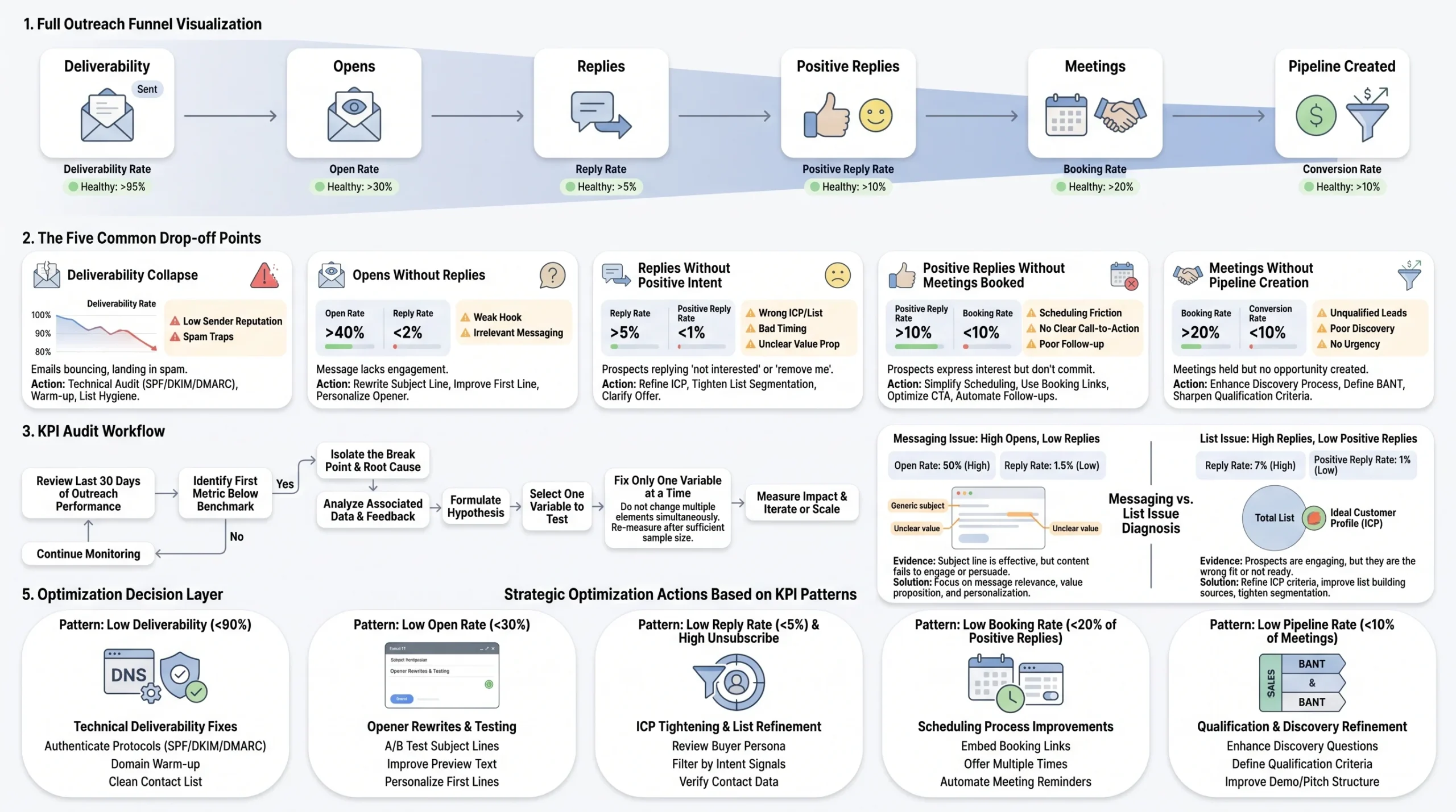
Cold outreach campaign KPIs are most valuable when they are used as a diagnostic system, not just a reporting system. Knowing your reply rate is 4% tells you something. Knowing that your reply rate dropped from 11% to 4% between month one and month two, while your open rate held steady at 48%, tells you something specific enough to act on.
The funnel runs in one direction: deliverability to opens to replies to positive replies to meetings. Each stage depends on the one before it. A problem at any stage creates a visible pattern in the numbers, and reading that pattern correctly is the difference between fixing the right thing and wasting three weeks testing subject lines when the real problem is your offer.
The Five Most Common Drop-Off Points and What Each One Signals
Drop-off at deliverability: Your sent volume holds but opens collapse. The emails are leaving your system but not reaching inboxes. This is almost always a technical problem: sending too fast from a young domain, accumulating spam complaints from a previous campaign, or a shared IP getting flagged by a major mail provider. The fix is technical, not editorial. Check your domain reputation through Google Postmaster Tools, reduce daily send volume, and run a deliverability audit before sending another sequence.
Drop-off between opens and replies: Your open rate is healthy (above 40%) but replies are below 3%. The subject line is working; the opener or the body is not. The most common cause is an opener that fails to establish relevance within the first two sentences. Cold email readers make a continue-or-delete decision within about three seconds of opening. If your first sentence reads as generic, they close it regardless of how good the rest of the email is. The fix is to rewrite the opener using a specific signal: a relevant company event, a shared connection, a recent funding announcement, something that makes the email feel written for that person rather than sent to a segment.
Drop-off between replies and positive replies: You are getting replies but they are polite declines, requests to be removed, or one-word deflections. This points to one of two problems: the ICP is off, meaning you are reaching people who have the title but not the pain, or the offer is off, meaning the pain exists but your product is not a clear solution for it in the prospect’s mind. A third possibility is timing: the prospect has the pain and you have the solution, but they are not in an active evaluation cycle. Timing mismatches are harder to diagnose from KPI data alone. They show up as polite “not right now” replies rather than hard declines.
Drop-off between positive replies and meetings booked: Prospects are expressing interest but not converting to calendar holds. This is a follow-through failure, not an outreach failure. Common causes include a slow or complicated scheduling process (asking for a back-and-forth rather than sending a Calendly link), a gap in follow-up after the initial positive reply, or a mismatch in meeting format expectations. Some prospects expect a brief discovery call; others expect a full demo invitation. If you are not clarifying the meeting type in your response, you are adding unnecessary friction to the conversion step.
Drop-off between meetings booked and pipeline created: Meetings are happening but they are not converting to opportunities. This is a qualification problem that lives upstream of your outreach program. The people you are booking are not the right fit, meaning your ICP definition needs tightening, not your outreach sequence. When sales-qualified meetings drop while outreach volume holds steady, the right fix is to add qualification criteria to the prospecting stage: more specific job title filters, minimum company size, industry constraints, or funding stage requirements.
How to Run a KPI Audit on an Underperforming Sequence in Under 30 Minutes
Pull the last 30 days of data for the sequence in question. Work from the top of the funnel down. Start with deliverability, then open rate, then reply rate, then positive reply rate, then meetings booked. Find the first stage where the number falls below benchmark. That is your break point.
Everything above the break point is working. Everything below it is downstream of a single fixable problem. Resist the instinct to optimize multiple stages at once. Change one variable, run the sequence for at least two weeks with a minimum of 200 sends, then measure again.
The most common mistake in sequence audits is making too many changes simultaneously and then being unable to attribute the improvement (or the further drop) to any specific fix.
When the Data Tells You to Fix the Message vs. When It Tells You to Fix the List
High deliverability plus high opens plus low replies: fix the message. The list is good. The subject line is good. The email body is not landing.
Low deliverability plus low opens plus low replies: fix the technical setup first, then re-evaluate message performance with clean deliverability data.
High reply rate plus low positive reply rate: fix the list. The message is starting conversations, but the wrong conversations. The people you are reaching are engaging out of politeness or confusion rather than genuine interest.
High positive reply rate plus low meeting conversion: fix the follow-through process, specifically the scheduling and response workflow between the first positive reply and the calendar hold.
LinkedIn-Specific KPIs That Most SDR Teams Are Not Tracking (But Should Be)
LinkedIn outreach has a distinct KPI layer that standard email-centric frameworks miss entirely. The channel operates differently: there is a connection request stage before any messaging can happen, the platform has daily interaction limits that directly cap volume, and post-reply conversations happen in a semi-public professional context that changes how prospects engage. Applying email metrics to LinkedIn outreach produces misleading benchmarks and bad optimization decisions.
Warmth score distribution across your prospect list is one of the most predictive pre-send metrics available for LinkedIn outreach. Warmth scoring categorizes prospects into Hot (direct signals of intent or high relevance match), Warm (shared connections, recent company news, job change), Neutral (ICP match but no specific signals), and Cold (ICP match only, no additional context). Before sending a single connection request, the distribution of warmth scores across your list tells you what your reply rate will look like. A list where 30% of contacts are Hot or Warm and 70% are Neutral or Cold will produce meaningfully different results than a list where 70% are Hot or Warm. Platforms like Clay and Apollo allow you to enrich prospect lists with intent signals, funding news, and job change data before building a campaign, which directly shifts warmth distribution before outreach begins.
Connection request acceptance rate by targeting segment gives you more precision than an aggregate acceptance rate. A 33% acceptance rate across a campaign of 1,000 contacts tells you the average is healthy. But if founders in Series A companies are accepting at 45% and VP-level contacts in enterprise are accepting at 18%, you have two very different audiences inside one campaign, and optimizing them with the same note and profile positioning will produce suboptimal results on both ends. Segment your acceptance data by job title, company size, and industry at minimum. The variance will show you where your positioning is landing and where it is not.
Time-to-reply after connection accepted is a behavioral signal that most teams track in aggregate but rarely use at the individual campaign level. A prospect who replies to your first message within four hours of accepting your connection is showing a level of attention and openness that a prospect who takes nine days to reply is not. Building a separate follow-up cadence for fast responders versus slow responders is not a commonly discussed tactic, but the data supports it. Fast responders are in an active engagement window; a same-day follow-up message from you is more likely to continue a conversation. Slow responders may have accepted the connection passively; a longer wait before your first message gives them more time to see your profile and establish passive familiarity.
Multi-account volume distribution is a KPI that only becomes relevant when you are running outreach across multiple LinkedIn accounts, which is standard for lead generation agencies and larger SDR teams. The question is not just how many messages went out across all accounts combined; it is how performance varies by account. One account running 40 connection requests per day with a 38% acceptance rate is performing differently than another account running the same volume at 19% acceptance, and the causes are different too. Profile strength, degree of network overlap with the target ICP, and account age all affect per-account performance. Tracking at the account level rather than only at the campaign aggregate level is the difference between identifying a fixable problem and averaging it into invisibility.
InMail vs. connection-plus-message reply rate comparison is worth tracking for teams that have access to LinkedIn Sales Navigator or LinkedIn Recruiter, both of which include InMail credits. InMail messages go directly to a prospect’s inbox without requiring a prior connection. The reply rate for InMail is lower than post-connection messages, typically 10% to 18% for well-targeted InMail versus 15% to 25% for first messages sent after a connection acceptance. InMail makes sense when the target list includes people who are unlikely to accept a cold connection request (C-suite contacts with large networks, for example) or when you need to reach someone quickly without waiting for the connection acceptance cycle.
How AI-Handled Reply Threads Change What You Track
When an AI engine is handling post-reply conversations rather than a human SDR, a new KPI layer becomes necessary: conversation-to-meeting conversion rate. This measures what percentage of positive replies that enter an AI-handled conversation result in a booked meeting.
Standard outreach platforms like HeyReach, Expandi, and Dripify automate the connection and messaging sequence, but they stop when a prospect replies. From that point, a human SDR picks up the conversation. Platforms that run the full conversation autonomously, including handling objections like “send me more info,” “I’m not the right person,” and “we already have a solution for this,” add a measurable conversion step between the positive reply and the calendar hold.
That conversation-to-meeting conversion rate is the KPI that validates whether the AI handling is working or creating drop-off of its own. If 30% of positive replies are converting to meetings when an SDR handles the conversation manually, but only 12% convert when the AI handles it, the AI’s objection handling needs work. If the AI conversion rate is 28% and the SDR rate is 22%, the AI is performing better and you have a staffing efficiency opportunity. Either way, you need to measure it separately to know.
Teams running Dealsflow’s Arlo AI for full-conversation handling get this data at the campaign level, which makes the comparison between AI-handled and manually-handled conversion rates measurable rather than anecdotal. The outcome is clearer pipeline attribution: you know exactly what percentage of your booked calls came from AI-run conversations versus human handoffs.
Outreach KPI Benchmarks for 2026: What Good Actually Looks Like by Segment
Benchmarks are only useful when they are specific to your channel, your ICP size, and your sequence type. A cold email benchmark for an SMB outreach sequence is not the right comparison point for an enterprise LinkedIn sequence targeting CFOs. Using the wrong benchmark leads to either false confidence (you are hitting a benchmark that does not apply to your context) or unnecessary alarm (you are below a benchmark that was never relevant to your situation).
Benchmark Reference by Channel, ICP Type, and Sequence Type
| Channel | ICP Type | Sequence Type | Connection/Delivery Rate | Open/Acceptance Rate | Reply Rate | Positive Reply Rate | Outreach-to-Meeting Rate |
|---|---|---|---|---|---|---|---|
| Cold Email | SMB | Cold | 95%+ | 45-55% | 8-15% | 3-5% | 1.5-3% |
| Cold Email | Mid-Market | Cold | 95%+ | 40-50% | 5-10% | 2-4% | 1-2.5% |
| Cold Email | Enterprise | Cold | 95%+ | 35-45% | 3-7% | 1-3% | 0.5-1.5% |
| Cold Email | Any | Re-engagement | 95%+ | 30-40% | 4-9% | 1.5-3.5% | 0.8-2% |
| SMB | Cold | 35-45% acceptance | N/A | 18-25% | 10-14% | 2-4% | |
| Mid-Market | Cold | 30-40% acceptance | N/A | 15-22% | 8-12% | 1.5-3% | |
| Enterprise | Cold | 22-32% acceptance | N/A | 10-18% | 5-9% | 0.8-2% |
Why Benchmarks Are Shifting in 2026
Three specific changes are pushing performance benchmarks down across all outreach channels.
Gmail and Outlook’s filtering algorithms are getting stricter. Both providers updated their bulk sender policies in 2024, and the downstream effect on cold email deliverability has been measurable. Domains that were hitting 97% deliverability in 2023 are now hitting 91% to 93% with identical technical setups because the filtering threshold for what counts as promotional or spam-adjacent has tightened. The practical implication: deliverability rates that would have been fine two years ago now require active monitoring and more conservative daily send volumes.
LinkedIn’s connection request limits tightened in 2021 and remain in force. Standard accounts are capped at roughly 100 connection requests per week under LinkedIn’s current limits. Accounts that push above that threshold risk temporary sending restrictions or permanent flagging. The practical ceiling for a single LinkedIn account running outreach is 80 to 100 requests per week, which limits monthly volume to roughly 320 to 400 contacts per account. Teams scaling LinkedIn outreach without adding accounts hit this ceiling quickly.
AI-generated outreach volume has increased dramatically. More teams are using AI writing tools to generate personalized-sounding messages at scale. The result is that prospects are receiving more messages that feel personalized but are not, which is raising skepticism and lowering response rates across the board. The bar for what reads as genuinely relevant has gone up. Generic personalization tokens like “I noticed you work at [Company]” are no longer differentiating; they are expected and often ignored.
Agency Benchmarks vs. In-House SDR Team Benchmarks
Agencies running outreach for multiple clients typically operate at higher volume and lower per-contact personalization than in-house SDR teams. The tradeoff is measurable. Agency-run LinkedIn campaigns tend to hit connection acceptance rates of 25% to 33%, with reply rates of 12% to 18% and positive reply rates of 5% to 9%. In-house SDR teams with tighter ICP definitions, more contextual personalization, and direct domain expertise in their product area consistently hit acceptance rates of 33% to 42%, reply rates of 18% to 26%, and positive reply rates of 9% to 14%.
The gap is not because agencies are worse at outreach. It is because the model is different. Agencies are optimizing for scalable process across diverse client ICPs. In-house teams are optimizing for deep relevance within one ICP they know intimately.
How to Set Internal Benchmarks When You Do Not Yet Have Enough Data
The minimum data threshold before a KPI is statistically meaningful is 200 sends or connection requests per sequence. Below that, you are reading noise, not signal. A 12% reply rate from 50 contacts could be a great sequence or four lucky responses. A 3% reply rate from 50 contacts could be a terrible sequence or a bad week with a good list.
Build your first internal benchmark from your first 500 contacts with a consistent sequence. That data set is large enough to identify real patterns. Use the industry benchmarks in this article as a directional reference, not an absolute standard, until you have enough of your own data to compare against.
When to Stop Optimizing and Kill a Campaign
A campaign is worth killing when it has reached 500 to 800 contacts with consistent targeting, sequence, and sending conditions, and the outreach-to-meeting rate sits below 0.3%. At that point, the problem is structural: either the ICP is wrong, the offer is wrong, or the channel is wrong for this audience. Iterating on subject lines or message copy when the core targeting is fundamentally off wastes time and burns through a finite list of prospects.
The threshold for giving up on a specific message variant is lower: 200 sends with no positive replies is enough to kill a message and test an alternative. The threshold for killing the campaign entirely requires more data because you want to separate a bad message from a bad market.
Building a Cold Outreach KPI Dashboard Your Entire Team Will Actually Use
A KPI dashboard that nobody looks at is just a reporting tax. The goal is a reporting structure that your team checks because it tells them something actionable, not because a manager scheduled a weekly review to go through it.
The core principle is this: every metric on a live dashboard should connect to a specific decision. If a number changes and nobody knows what to do differently as a result, it should not be on the dashboard.
What Belongs in a Weekly SDR KPI Report vs. a Monthly Leadership Report
A weekly SDR KPI report should be operational. It should answer: is each rep hitting their activity targets, and are those activities producing replies and meetings at the expected rate? The metrics belong in a weekly report:
- Daily send or connection request volume per rep (vs. target)
- Reply rate per active sequence
- Positive reply rate per active sequence
- Meetings booked for the week (vs. weekly target)
- Any sequences with a reply rate drop of more than 30% week-over-week (a flag for investigation)
A monthly leadership report should be strategic. It should answer: is the outreach program producing pipeline at an acceptable cost, and what do the trends tell us about what to change? The metrics that belong in a monthly report:
- Meetings booked (vs. monthly target and vs. prior month)
- Outreach-to-meeting rate (trend over 90 days)
- Cost per meeting booked
- Pipeline created from outreach (for teams with a short enough sales cycle to see this monthly)
- Channel performance comparison: email vs. LinkedIn conversion rates
The Five Metrics That Should Be on Every Outreach Team’s Live Dashboard
If you had to reduce your entire reporting stack to five numbers that were always visible and always current, these are the five:
- Meetings booked (rolling 30 days): the output metric that everything else exists to explain
- Positive reply rate (current active sequences): the leading indicator of meeting volume two to three weeks out
- Outreach-to-meeting rate (rolling 90 days): the health check for the entire funnel
- Email deliverability rate (current sending domains): the technical health check that prevents invisible problems from compounding
- LinkedIn connection acceptance rate (rolling 30 days): the top-of-funnel signal for LinkedIn campaign health
Everything else is supporting data for when one of these five numbers moves.
How to Structure KPI Reporting for Agencies Managing Multiple Clients
Agency reporting has a layer that in-house teams do not have: the client level. An aggregate report showing strong performance across a portfolio can mask a single client’s campaign that is failing badly. Client-level KPI reporting is not optional for agencies; it is the accountability structure that keeps client relationships intact and allows accurate billing.
A clean agency KPI reporting structure separates performance at three levels:
- Account level: individual LinkedIn account performance (acceptance rate, reply rate, meetings booked)
- Campaign level: performance per client campaign (outreach-to-meeting rate, cost per meeting, positive reply rate)
- Portfolio level: aggregate across all clients (used for agency-level capacity planning and tooling decisions)
For agencies running multi-account LinkedIn outreach across 10 or more clients, full-funnel KPI visibility from connection request to booked call in a single dashboard removes the manual reporting layer that otherwise requires exporting data from multiple tools and building spreadsheets every week.
Common Dashboard Mistakes
The three most common dashboard mistakes are tracking too many metrics, reporting lagging indicators only, and leaving out the benchmark column.
Too many metrics dilute attention. When a dashboard has 20 rows, nobody scans all 20 with equal attention. The important numbers get lost in the noise of the less important ones. The rule of thumb: if a metric does not appear in a weekly conversation between a sales leader and an SDR, it should not be on the primary dashboard.
Reporting only lagging indicators means your dashboard tells you what happened but not what is about to happen. Meetings booked last month is a lagging indicator. Positive reply rate this week is a leading indicator. Positive replies convert to meetings roughly two to three weeks later depending on your prospect’s buying cycle. A dashboard without leading indicators gives you no advance warning when pipeline is about to drop.
Leaving out a benchmark column turns every number into an abstract value. A reply rate of 7% means nothing without context. A reply rate of 7% against a benchmark of 10% for this sequence type is a specific gap worth investigating.
How to Use Weekly KPI Reviews to Run a Structured Coaching Conversation with an SDR
A KPI review with an SDR should not be a reporting session. It should be a diagnostic conversation. The structure that works:
Start with the output metric. What was their meeting-booked count this week versus target? If they hit target, the conversation shifts to what is working and whether it can be scaled. If they missed, the conversation moves to the funnel.
Work backward from the output gap. Was the gap in positive replies, in replies, in opens, or in deliverability? Identify the first stage below benchmark. That is the coaching topic for this week. One fix at a time.
Close with a specific experiment. What will they test differently this week, how will they measure it, and when will you review the result? A coaching conversation without a specific commitment and a measurement date does not change behavior.
Conclusion
Every broken outreach program has a moment when the numbers would have told you what was wrong, if you had been reading them correctly. Cold outreach campaign KPIs are not a reporting formality; they are the operating system for a function that is supposed to produce pipeline, not just activity. The teams that consistently book meetings are not necessarily sending more; they are reading the funnel more clearly and fixing the right thing at the right time.
The practical step from here is straightforward. Pull your current active sequences. Find the first stage in the funnel where performance falls below the benchmarks in this article. That single drop-off point is the thing worth fixing this week. Not the subject line, not the call-to-action, not the sequence length: the specific transition in the funnel where your prospects are stopping. Fix that, measure it for two weeks with at least 200 sends, and then reassess.
Everything else, the dashboards, the reporting structures, the agency frameworks, those are infrastructure for doing this diagnostic work faster and more consistently over time.
Frequently Asked Questions
What are the most important KPIs for a cold outreach campaign?
The most important cold outreach campaign KPIs are positive reply rate, outreach-to-meeting rate, and meetings booked. Positive reply rate tells you whether your message is resonating with the right people. Outreach-to-meeting rate tells you whether your entire funnel is working end-to-end. Meetings booked is the output metric that all other KPIs exist to explain and improve. Activity metrics like send volume and connection requests matter for diagnosing problems but should never be the primary reporting metric.
What is a good reply rate for cold email in 2026?
A realistic cold email reply rate benchmark in 2026 is 5% to 15%, depending on your ICP, list quality, and sequence personalization. SMB-targeted sequences with a tight ICP and a specific pain-point offer tend to hit the higher end of that range. Enterprise-targeted sequences tend to sit at the lower end because decision-makers receive higher volumes of outreach and have lower baseline engagement rates with cold messages. A reply rate above 15% from a list of 200 or more contacts usually indicates strong ICP alignment and a well-constructed opener.
What is a good LinkedIn connection acceptance rate?
A realistic LinkedIn connection acceptance rate benchmark is 30% to 40% for outreach that includes a personalized, non-promotional connection note. Without a note, acceptance rates typically fall to 20% to 28%. Below 25% with a personalized note consistently suggests either poor ICP targeting, a LinkedIn profile that lacks credibility in the prospect’s industry, or a connection note that reads as a sales pitch. Above 45% indicates strong ICP-to-sender alignment, which usually means you are reaching an audience that already knows who you are or operates in a tight professional network where you have shared connections.
How do I calculate my outreach-to-meeting rate?
Outreach-to-meeting rate is calculated by dividing the number of meetings booked by the total number of unique prospects contacted across your full sequence, then multiplying by 100 to express it as a percentage. If you contacted 500 unique prospects in a campaign and booked 10 meetings, your outreach-to-meeting rate is 2%. This calculation should include all contacts who entered the sequence, not just those who replied or engaged, because the denominator represents the full cost of the campaign.
What is the difference between reply rate and positive reply rate?
Reply rate measures all responses to your outreach, including negative replies, requests to unsubscribe, and out-of-office messages. Positive reply rate measures only responses that indicate genuine interest: questions about your product, requests for a demo, expressions of timing interest, or referrals to a relevant decision-maker. The gap between the two numbers is diagnostic. A high reply rate with a low positive reply rate means your message is generating reactions but not interest, which points to an ICP or positioning problem rather than a message clarity problem.
How many cold outreach touchpoints should I track per sequence?
You should track performance at every touchpoint in your sequence separately, not just the aggregate sequence-level metrics. A five-step sequence where 70% of positive replies come from step four is telling you something important: either your earlier steps are warming prospects up effectively, or they are too aggressive and prospects are waiting for follow-up before engaging. Touchpoint-level data tells you which step is generating the most value and where you have room to shorten the sequence without losing outcomes.
Why is my open rate high but my reply rate low?
A high open rate with a low reply rate almost always means the subject line is working and the email body is not. The most common cause is an opener that fails to establish specific relevance within the first two sentences. Cold email readers decide whether to continue reading within the first three seconds of opening, and a generic opener like “I came across your profile and wanted to reach out” gives them no reason to keep reading. The fix is to rewrite the opener using a specific, verifiable signal about the recipient’s company or role that makes the email feel written for them rather than templated.
How do agencies report cold outreach KPIs to clients?
Agencies should report cold outreach KPIs to clients at the campaign level, with at minimum: connection acceptance rate (for LinkedIn campaigns), positive reply rate, meetings booked for the period, and outreach-to-meeting rate. Monthly reports should include a trend comparison to the prior period so clients can see whether performance is improving, holding, or declining. Agencies should avoid reporting raw activity metrics (sends, connection requests) as primary KPIs to clients; clients care about meetings and pipeline, not volume.