
Most LinkedIn users check their analytics the same way they check their phone battery — a quick glance, a vague sense that things are either fine or not, and then back to whatever they were doing. The number goes up, they feel good. The number goes down, they feel confused. Then nothing changes.
That approach worked fine when LinkedIn was a passive professional network. It does not work now. LinkedIn in 2026 is the most important organic B2B marketing channel available, and the platform has fundamentally changed how it distributes content, which metrics it rewards, and what “good performance” actually looks like. Impressions are down 63% since 2023 across the platform, but engagement per post is up. Company pages are receiving roughly 5% of user feed allocation while personal profiles dominate 65% of content consumption. New signals like Saves, Sends, and Dwell Time are now what drive algorithmic reach, and most of the dashboards people stare at every week do not even show them clearly.
This guide covers every layer of LinkedIn analytics: what each metric actually means, how to read what the data is telling you, what benchmarks to measure yourself against, and how to turn that data into a strategy that produces better results week over week. Nothing here is theoretical. Every benchmark and claim is grounded in current data from LinkedIn’s own engineering publications, Sprout Social’s Q1 2026 Index, Richard van der Blom’s 1.8-million-post algorithm analysis, and the Buffer State of Social Media Engagement 2026 report covering 52 million posts.
What Are LinkedIn Analytics? (And Why Most Marketers Read Them Wrong)
LinkedIn analytics is the measurement system built into the platform that tracks how your content, your profile or page, and your audience are performing over time. It covers everything from how many people saw a post to what industries your followers work in, from how many people clicked a link to how fast your follower count is growing. That much most people know.
What most people get wrong is which numbers actually matter and what it means when they change.
LinkedIn Analytics Defined: Pages vs. Personal Profiles
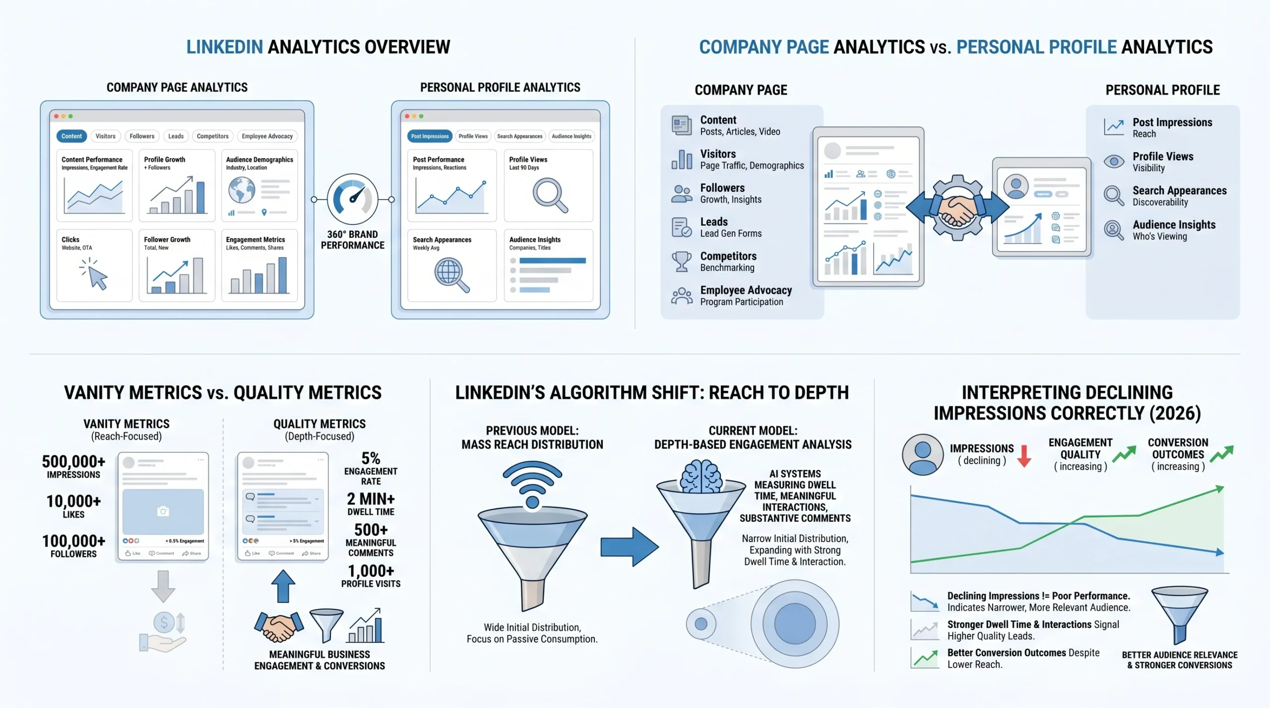
LinkedIn analytics operates differently depending on whether you are managing a company page or a personal profile, and understanding this distinction shapes everything else.
Company page analytics are available to any admin or designated analyst on the page. They are organized into six tabs: Content, Visitors, Followers, Leads, Competitors, and Employee Advocacy. Each tab shows a different dimension of how your page is performing, and the data goes back up to 365 days depending on the metric. Note that as of late 2025, LinkedIn has placed some advanced company page analytics behind a LinkedIn Premium paywall, including certain demographic breakdowns and competitive data.
Personal profile analytics are visible only to the profile owner and sit in a dashboard section called “Analytics and tools” or, for Creator Mode users, a more prominent analytics panel. Personal profile analytics show Post Impressions, Profile Views, Search Appearances, and audience demographics. They are less granular than company page analytics in some respects, but they capture data that company pages cannot, including who specifically viewed your profile after seeing your content.
Both can be accessed from the same LinkedIn account if you manage a company page. Toggling between them gives you what one analytics guide calls “a 360-degree view of your brand’s total performance on the platform.”
The Two Types of Analytics Data: Vanity Metrics vs. Quality Metrics
This is the distinction that separates people who use LinkedIn analytically from people who just watch numbers.
Vanity metrics are figures that look meaningful but do not reliably tell you whether your content strategy is working. Impressions, follower count, and total likes all fall into this category. They can be inflated by algorithmic quirks, engagement pods, or content that went briefly viral without generating any actual business outcome. Tracking them is not wrong, but optimizing for them leads to hollow strategies.
Quality metrics are figures that reflect actual engagement depth, audience fit, and business intent. Engagement rate, dwell time, comment quality, profile views per post, and click-through rate all fall here. These are the metrics that correlate with real outcomes: inbound connection requests, lead form submissions, and website conversions.
The clearest way to think about the difference: a post with 50,000 impressions and 200 likes that generated zero profile visits and zero clicks produced no business result. A post with 3,000 impressions, 180 comments, and 120 profile visits likely moved multiple people down a buying journey.
Why Impressions Declining Does Not Mean Your Strategy Is Failing
Between 2023 and 2026, LinkedIn impressions dropped 63-66% across the platform. That is not a typo, and it is not a bug. It is a deliberate algorithmic shift.
LinkedIn’s algorithm underwent a major structural change, moving from a model that rewarded reach (how many people saw your post) toward a model that rewards depth (how long people engaged with it and how substantively they responded). Content is now shown to fewer people initially, but those people are more relevant to your niche. If they engage meaningfully, the post expands. If they scroll past in under three seconds, it does not.
The result is that a creator or brand seeing declining impressions in 2026 might actually be performing better than they were in 2024, if their engagement rate, comment depth, and profile visit rate are up. Reading analytics without understanding this context leads to wrong conclusions and wrong strategy changes.
How LinkedIn’s Algorithm Reads Your Content (What the Stats Actually Measure)
Before you can read your analytics accurately, you need to understand what LinkedIn’s algorithm is actually measuring behind the scenes. The metrics in your dashboard are outputs of a ranking system, and without knowing how that system works, you are reading results without understanding causes.
The Depth Score: LinkedIn’s New Primary Ranking Signal
In 2026, LinkedIn’s primary content ranking signal is what researchers and analysts are calling the Depth Score. LinkedIn’s own engineering team described the underlying mechanism in their October 2024 publication “Leveraging Dwell Time to Improve Member Experiences,” and the system has been detailed in peer-reviewed papers including LiRank (arXiv 2402.06859) and LiGR (arXiv 2502.03417).
The Depth Score is not a single metric you can see in your dashboard. It is a composite score that LinkedIn’s algorithm assigns to each piece of content based on how deeply users engage with it. It factors in the following signals, roughly in order of weight:
- Reading time (dwell time): How long users spend on the post before scrolling
- Comment depth: Whether comments generate replies and substantive threads
- Saves: Whether users bookmark the post for later reference
- Private shares (Sends): Whether users forward the post in direct messages
- Engagement velocity: How quickly the post accumulates meaningful engagement in its first hour
A post that scores high on the Depth Scale gets distributed to progressively wider audiences: first your immediate connections, then second-degree connections, then topical interest groups and hashtag followers. A post that scores low gets limited to your immediate network and often not even all of them.
Dwell Time Explained: Why 61 Seconds Is the Threshold That Matters
Dwell time measures how long a user pauses on your content before scrolling past. LinkedIn’s algorithm treats this as the clearest single signal of whether a post is worth distributing further.
According to third-party analytics research based on LinkedIn’s published engineering methodology, posts achieving over 61 seconds of dwell time average a 15.6% engagement rate. Posts that are scrolled past in 0-3 seconds average a 1.2% engagement rate. That is a 13x difference in engagement outcome based purely on whether someone paused to read.
What drives dwell time:
- Hook quality: The first one or two lines of a post determine whether someone expands it or scrolls past. A question, a contrarian claim, or a specific data point in the opening line consistently outperforms generic openers.
- Formatting: Research shows formatted content sustains 40% longer dwell time than unstructured wall-of-text posts. Short paragraphs, line breaks, and visual breathing room keep readers moving through the post rather than abandoning it.
- Actionable depth: Posts that contain a framework, checklist, or insight someone would want to apply generate longer dwell time because readers slow down to absorb the information.
- Personal narrative: Posts that combine professional expertise with a personal story sustain longer engagement because stories create emotional investment.
Dwell time is not directly visible in your LinkedIn analytics dashboard, but it influences every metric that is. When your engagement rate is high relative to your impressions, sustained dwell time is usually a significant contributing factor.
Why Comments Carry More Algorithmic Weight Than Likes
LinkedIn’s algorithm does not treat all engagement equally. Comments generate substantially more distribution signal than likes or reactions. AuthoredUp’s 2025 analysis of three million posts framed the gap conservatively, noting that comments count roughly twice as much as likes in distribution weighting, with the algorithm applying additional quality scoring on top of that.
Critically, the quality of comments matters, not just the count. Generic comments like “Great post!” or “So true!” no longer boost reach because LinkedIn’s natural language processing system now evaluates whether comments contain specific questions, professional insight, or personal experience. A thread of five substantive back-and-forth replies carries significantly more algorithmic weight than 20 one-word reactions.
This has direct implications for how you read your analytics. A post with 15 comments and a genuine discussion thread may outperform a post with 80 likes in terms of reach expansion, even though the likes look more impressive on the dashboard.
Saves and Sends: The New Engagement Signals Added in Late 2025
In late 2025, LinkedIn added Saves and Sends to post-level analytics. This was a deliberate signal from LinkedIn about what the platform values. When users save a post, they are telling the algorithm it has lasting reference value. When they send it in a direct message, they are telling the algorithm it was worth sharing privately, which is a strong authenticity signal that engagement pods cannot replicate.
Saves and Sends are now visible in your post analytics under the “Other actions” section. Tracking these alongside reactions and comments gives you a fuller picture of content quality. A post with high Saves relative to impressions is content your audience finds genuinely useful. A post with high Sends is content that sparks real conversations outside the feed.
Company Page Analytics vs. Personal Profile Analytics: Key Differences
The gap between how company pages and personal profiles perform on LinkedIn in 2026 is large enough that treating them as equivalent would lead you to draw completely wrong conclusions from your data.
Why Your Company Page Reach Looks Lower Than Expected
If you manage a company page and your reach numbers seem inexplicably low, you are not doing something wrong. You are experiencing a structural platform reality.
Company pages now receive approximately 5% of user feed allocation, while personal profiles dominate 65% of content consumption on the platform. Sprout Social’s Q1 2026 Index reports a median engagement rate of roughly 1-2% for company pages, compared to 4.7% for personal-profile content. Organic reach for company pages has dropped approximately 60% since 2024, according to multiple independent analyses. This is not a temporary algorithm fluctuation. It is a structural realignment that LinkedIn has confirmed through its product decisions, including the increased emphasis on Creator Mode for individuals and the addition of the Employee Advocacy tab as a primary feature in company page analytics.
The underlying reason is that LinkedIn’s algorithm prioritizes peer-to-peer interaction. A person sharing an insight with their professional network triggers a different trust response from other users than a brand broadcasting a message. The algorithm is designed to reflect that difference.
What Personal Profile Analytics Show That Page Analytics Do Not
Personal profile analytics contain several data points that company page analytics do not surface, and for B2B brands, some of these are the most valuable signals available:
- Who viewed your profile: Personal profiles show specific individuals who visited your profile after seeing your content. This is direct evidence of someone moving down an intent funnel. A post that generated 50 profile views from decision-makers in your target segment is far more valuable than a post with 500 likes from unqualified viewers.
- Search appearances: Personal profiles show how often your profile appeared in LinkedIn search results and what search terms triggered those appearances. This data is invisible at the company page level.
- Connection request patterns: A spike in inbound connection requests following a specific post is a strong business-intent signal that only exists at the personal profile level.
For B2B brands, this means that the most valuable LinkedIn analytics data in your organization is often sitting in the personal profiles of your founders, executives, and sales team, not in your company page dashboard.
Employee Advocacy Metrics and Why They Matter More Than Ever
LinkedIn’s own company page analytics includes an Employee Advocacy tab precisely because the platform acknowledges the structural advantage of employee-shared content. Content shared by employees through their personal profiles reaches audiences that company page posts cannot access, and it does so with the trust signal of a peer recommendation rather than a brand advertisement.
The performance difference is meaningful. According to research cited by Sprout Social and others, employee-reshared content achieves 561% greater reach than the same content posted from a company page. Employees collectively hold approximately ten times more first-degree connections than the average company page has followers, which means the distribution potential is structurally larger. Posts from individuals also convert at 2-5% of engaged users into marketing-qualified leads, versus 0.5-1% for company page posts.
The Employee Advocacy tab in your company page analytics shows:
- How many employees are sharing company content
- The reach generated by employee shares
- Engagement metrics on those shared posts
- Which employees are driving the most advocacy activity
Tracking this data regularly allows you to identify your most effective internal advocates, measure the ROI of employee advocacy programs, and make a data-backed case for investing in personal brand development for your team.
How to Access LinkedIn Analytics
Knowing where to find your data is the prerequisite for reading it. LinkedIn has reorganized its analytics interface multiple times, and the current layout in 2026 is significantly different from what existed two years ago.
Accessing Analytics on Your Company Page (Step-by-Step)
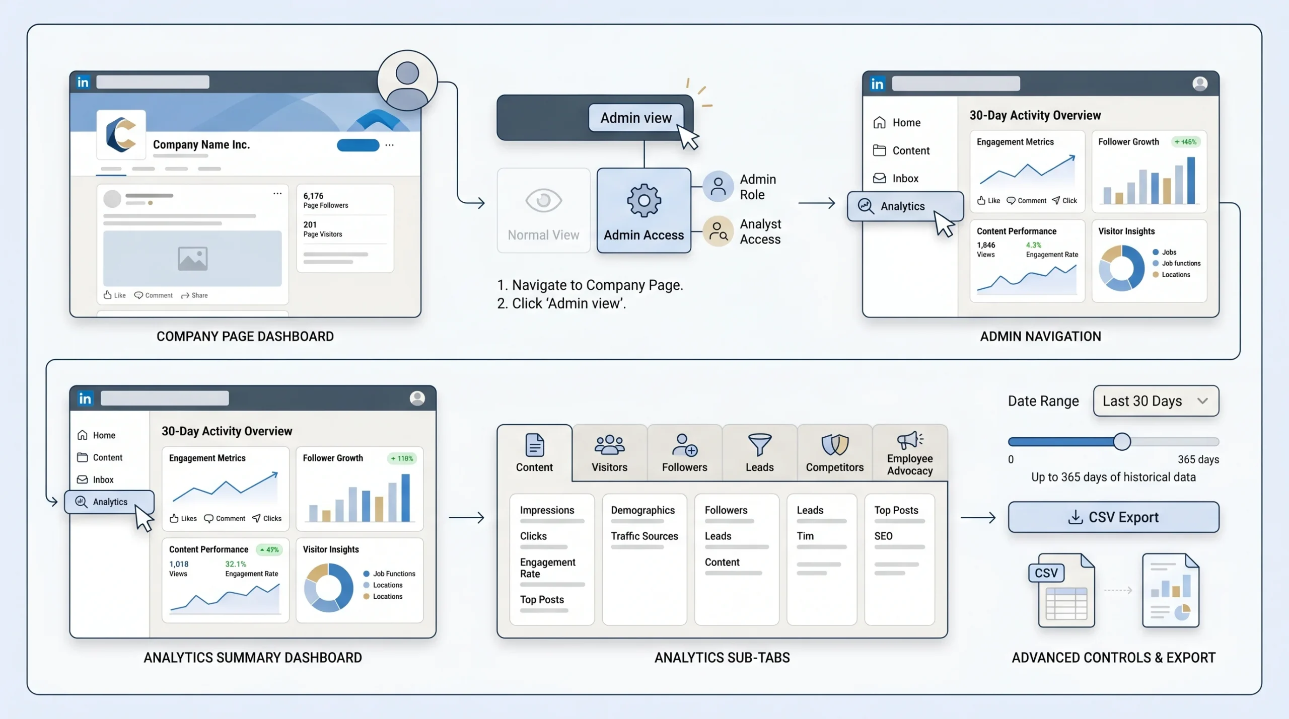
- Log in to LinkedIn and navigate to your company page.
- Click “Admin view” at the top right if you are not already in it. You must be a page admin or have designated Analyst access to see analytics.
- Click “Analytics” in the left-hand navigation menu.
- The Analytics section opens to a summary dashboard showing a snapshot of activity from the past 30 days.
- Use the sub-tabs to access specific data sets: Content, Visitors, Followers, Leads, Competitors, and Employee Advocacy.
- Use the date range selector at the top of each report to adjust the time period. Most metrics support up to 365 days of historical data.
- Use the “Export” button in the top right of each sub-tab to download data as a CSV file for further analysis.
Accessing Analytics on Your Personal Profile
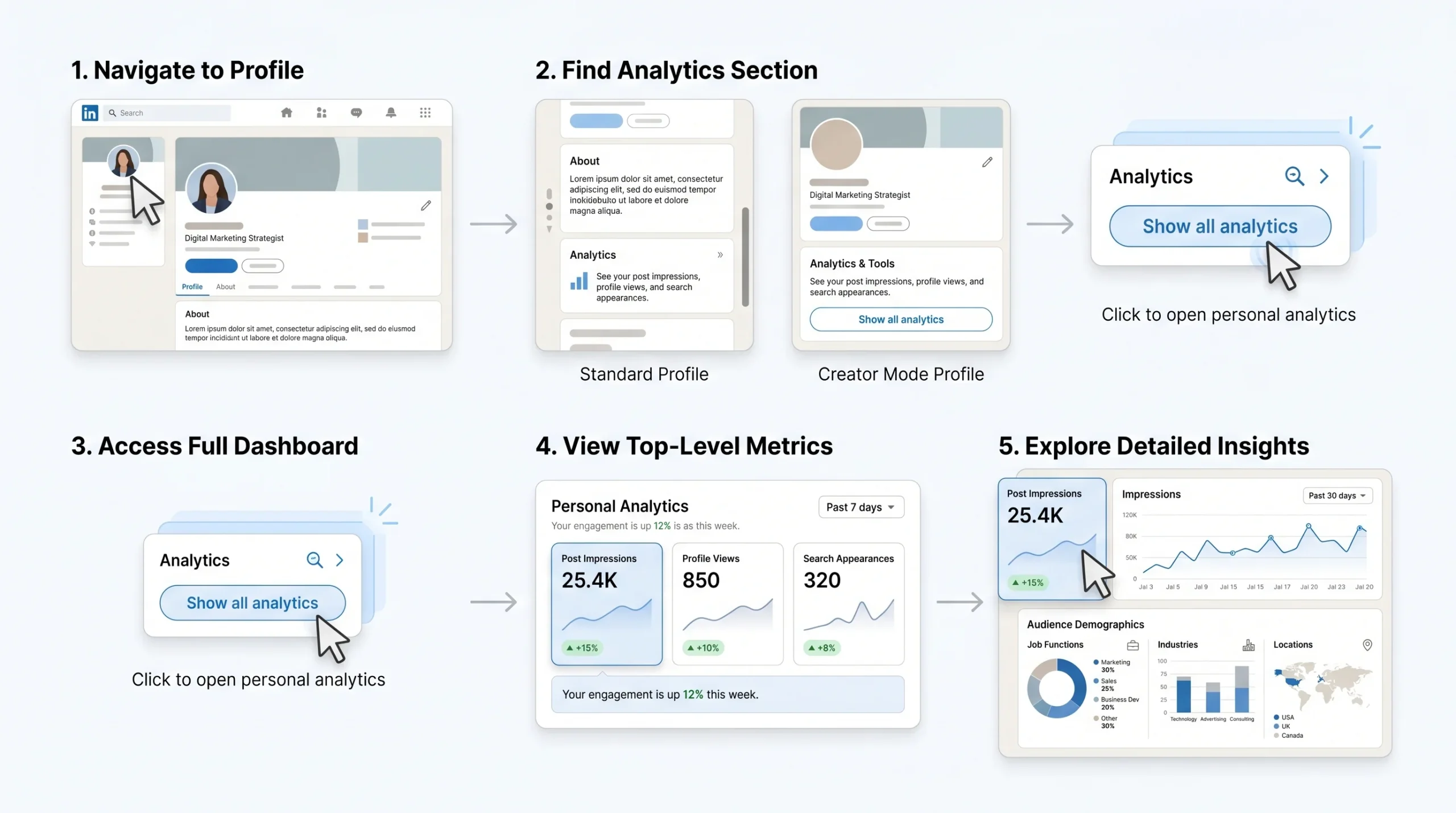
- Log in to LinkedIn and go to your personal profile.
- Scroll down past your About section until you see an “Analytics” panel. If you have Creator Mode enabled, this panel is prominently displayed near the top of your profile.
- Click “Show all analytics” to open the full analytics dashboard.
- The personal profile dashboard shows Post Impressions, Profile Views, and Search Appearances at the top level.
- Click into any metric to see a time-series breakdown and, where available, demographic data about who is driving the activity.
What Is Behind the LinkedIn Premium Analytics Paywall in 2026
LinkedIn moved several analytics features behind its Premium tier in late 2025, which affects what company page admins and individual users can see without a paid subscription.
Company page admins without Premium lose access to:
- Detailed visitor demographic breakdowns (industry, seniority, job function) beyond summary-level data
- Extended competitor analytics, including detailed follower and engagement comparisons
- Full Leads tab data for Lead Gen Form campaign performance
Personal profile users without Premium see limited data in the “Who viewed your profile” section, with full viewer lists available only to Premium subscribers.
These restrictions are worth factoring into your analytics setup. For companies running active LinkedIn strategies, the data locked behind Premium is often too valuable to do without, particularly the visitor demographic data that tells you which job titles and industries are paying attention to your page.
Key Tabs Explained: Content, Visitors, Followers, Competitors, Employee Advocacy
Each tab in the company page analytics dashboard answers a different question about your LinkedIn presence:
- Content tab: Shows performance data for every post your page has published: impressions, reach, clicks, click-through rate, reactions, comments, reposts, and engagement rate. This is your primary tab for evaluating content strategy.
- Visitors tab: Shows who is visiting your page without following it. Includes page views, unique visitors, and demographic breakdowns by job function, location, industry, seniority, and company size. This data tells you whether the right audience is finding you.
- Followers tab: Tracks your follower count over time, follower growth rate, and follower demographics. Useful for measuring audience-building progress and auditing whether your followers match your target customer profile.
- Leads tab: Available to pages running Lead Gen Form ad campaigns. Shows form opens, submissions, completion rate, cost per lead, and lead demographics.
- Competitors tab: Lets you compare your page against up to nine competitor pages on follower count, follower growth, post frequency, and engagement metrics. LinkedIn provides this data at a summary level.
- Employee Advocacy tab: Tracks content shared by your employees, the reach generated by those shares, and which employees are driving advocacy activity.
The LinkedIn Metrics That Actually Matter in 2026
Not all metrics deserve equal attention. Tracking every number LinkedIn shows you creates analysis paralysis without producing better decisions. The following metrics are the ones with demonstrated connections to content performance and business outcomes.
Reach vs. Impressions: The Most Misunderstood Distinction
Reach is the number of unique users who saw your post. Impressions is the total number of times your post was displayed, including multiple displays to the same user.
A post with 10,000 impressions and 1,000 reach was seen an average of ten times by each of 1,000 people. A post with 10,000 impressions and 8,000 reach was seen roughly 1.25 times by 8,000 different people. These tell completely different stories about distribution.
In 2026, reach is the more reliable of the two for measuring content distribution because it is not inflated by repeat views. High impressions with low reach typically indicates your content is circulating within a small, already-engaged audience rather than expanding to new viewers. Prioritizing reach over impressions gives you a more accurate picture of how far your content is actually spreading.
Engagement Rate: Formula, Benchmarks, and What “Good” Looks Like
Engagement rate is calculated using the following formula:
(Total Engagements / Impressions) x 100
Total engagements include reactions, comments, shares, clicks, and saves.
Based on 2026 benchmark data, the following reference points apply:
- Average engagement rate for personal profiles: 3.85%, up from 3.2% in 2024 (Linklulu, 2026 benchmark analysis)
- Average engagement rate for company pages: 2.1%
- Good engagement rate: 4% to 6%, placing you above the platform average
- Excellent engagement rate: Above 8%, indicating strong content-audience fit
- Viral-level engagement: Above 10%
Your industry significantly affects what a healthy engagement rate looks like. Technology and finance sectors typically see lower rates than education or nonprofit content, which attracts more participatory audiences. Follower count also matters: creators with smaller but more targeted audiences consistently outperform large accounts in engagement rate percentage, because their content reaches people who genuinely want to hear from them.
A creator with 2,000 followers generating 8% engagement produces more total interactions than someone with 50,000 followers generating 0.5% engagement. The absolute numbers favor the larger account, but the business impact often favors the smaller, more engaged one.
Dwell Time and Engagement Velocity
As discussed in the algorithm section, dwell time is not directly visible in your dashboard but it is measurable indirectly through patterns in your post data. Posts with high engagement rates relative to impressions have generally achieved sustained dwell time. Posts where you see significant reach expansion in the 24-48 hours after publishing have typically triggered the algorithm’s positive dwell-time signals.
Engagement velocity refers to how quickly a post accumulates meaningful engagement after it is published. Posts that generate three or more substantive comments within the first 60 minutes receive approximately 5.2x reach amplification, according to Richard van der Blom’s 2025 analysis of 1.8 million posts. This is why your first hour after publishing matters enormously: responding to early comments quickly, being available to answer questions, and actively participating in the thread during that window significantly affects how widely the post is distributed.
In your analytics, you can track engagement velocity by looking at the time-distribution data available in the expanded post analytics view. Compare your fastest-growing posts against your slowest to identify patterns in posting time, content format, and topic.
Profile Views Per Post: The Most Underrated Metric
Profile views per post is the metric that most LinkedIn analytics guides skip, and it is arguably the most directly tied to business outcomes. When someone reads your post and then clicks through to your profile, they have signaled intent. They are not just engaging with the content; they are evaluating you as a person, an expert, or a potential partner.
Tracking profile views in the days following a specific post gives you a measure of authority-building, not just content performance. A post that generated moderate impressions but drove 40 profile visits from senior decision-makers in your target industry is a high-performing post regardless of what its engagement rate says.
To track this at the post level, note your baseline profile view count before publishing, then monitor it for 48-72 hours afterward. LinkedIn does not provide a direct “profile views generated by this post” metric, so this requires manual tracking or a third-party tool like Shield Analytics.
Follower Growth Rate and Quality
Raw follower count is a vanity metric. Follower growth rate and follower quality are quality metrics.
Follower growth rate is calculated as:
(New Followers in Period / Total Followers at Start of Period) x 100
A company with 5,000 followers gaining 250 per month has a 5% monthly growth rate. Benchmarking this against your prior months tells you whether your content strategy is expanding your audience or stagnating.
Follower quality is assessed through the demographic data in the Followers tab. Check whether the industries, job functions, and seniority levels of your followers match your target customer profile. Gaining 500 followers from irrelevant industries is worse than gaining 50 followers who are all decision-makers in your target segment, because an unqualified audience drags down your engagement rate and sends irrelevant demographic data back to the algorithm.
Click-Through Rate (CTR) and Link Performance
Click-through rate measures the percentage of people who saw your post and clicked a link in it. The formula is:
(Clicks / Impressions) x 100
CTR is most relevant when your content goal is driving traffic to a website, landing page, or lead magnet. It is also one of the metrics most affected by LinkedIn’s 2026 algorithm changes: external links now suppress reach by approximately 60%, according to multiple independent analyses. This means posts with links reach fewer people, making CTR a metric that operates in a smaller pool than it used to.
The practical implication is that if you are measuring CTR, also look at your absolute click volume in the context of the reduced reach. A 3% CTR on 500 impressions produces 15 clicks. A 1% CTR on 5,000 impressions produces 50 clicks. Post design that maximizes impressions and reach, even at a lower CTR, may produce better raw traffic results.
Saves and Reposts as Quality Signals
Saves indicate that a reader found your content worth returning to later. This is one of the strongest quality signals available in your analytics because it reflects considered judgment, not an impulsive reaction. A post with a high save rate relative to impressions is almost certainly generating extended dwell time and ranking well in the Depth Score system.
Reposts (formerly shares) indicate that someone found your content worth associating their name with in front of their own audience. This is a more demanding threshold than a like or even a comment, which makes repost rate a useful benchmark for measuring content that resonates at a professional identity level.
Both are available in the expanded post analytics view on company pages. On personal profiles, they appear in the individual post analytics accessible by clicking “View analytics” below any published post.
Visitor Demographics: Job Title, Industry, Seniority, Company Size
The Visitors tab on your company page shows who is coming to your page, broken down by job function, industry, location, seniority level, and company size. This data is collected from users who have viewed your page within a selected date range, regardless of whether they follow you or engaged with your content.
This is some of the highest-quality signal in your entire analytics dashboard. It tells you whether your content and page positioning are attracting the right type of professional. If you are a B2B SaaS company targeting VP-level buyers in the technology sector and your visitor demographics show primarily junior marketers in retail, your positioning or content is off regardless of what your engagement rate looks like.
Check visitor demographics monthly, not just when something seems wrong. Gradual drift in the audience profile often precedes performance declines by several weeks, giving you early warning to adjust your content strategy.
LinkedIn Analytics Benchmarks by Industry and Account Type (2026 Data)
Benchmarks without context produce bad decisions. A 2% engagement rate is excellent for a large company page and concerning for a personal profile with 500 followers. The following benchmarks provide the context needed to evaluate your numbers honestly.
Engagement Rate Benchmarks by Sector
Engagement rates on LinkedIn vary meaningfully by industry. Based on 2026 data from aggregated analyses:
- Education and nonprofit: Typically above average, often in the 4-6% range, because content in these sectors attracts highly invested audiences who comment substantively
- Technology and software: Generally in the 2-3.5% range for company pages, higher for personal profiles of technical experts
- Financial services: Typically in the 1.5-3% range due to compliance-driven caution in content
- Marketing and advertising: Highly variable. Marketing professionals are both the most active LinkedIn users and the most skeptical of promotional content, which creates a bimodal distribution
- Healthcare and life sciences: Growing engagement sector, with professional education content consistently above 4% for personal profiles
These ranges should be treated as directional, not definitive. Your specific audience, niche, and content format will always have more influence on your engagement rate than your industry category alone.
Follower Count vs. Engagement Rate: Why Bigger Is Not Always Better
The relationship between follower count and engagement rate is inverse on LinkedIn, as it is on most social platforms. Larger accounts reach a broader, more diluted audience, which reduces the percentage of followers who engage with any given post.
Linklulu’s 2026 benchmark analysis found that reaching the top 25% of LinkedIn performers in engagement rate requires consistently scoring above 5%, which is achievable regardless of follower count with strong content strategy and audience targeting. This matters because it means a company with 2,000 followers can outperform a competitor with 50,000 followers in terms of content-audience fit, even if the absolute engagement numbers are smaller.
Posting Frequency Benchmarks
Based on 2026 data and algorithm behavior:
- Company pages: Three to five posts per week is optimal. Posting more frequently causes your content to compete with itself in followers’ feeds, which dilutes engagement on individual posts.
- Personal profiles: Daily posting is acceptable if content quality remains high. The 2026 algorithm actively penalizes low-quality content regardless of frequency, and one strong post per week will outperform five mediocre ones.
The critical mistake is posting to maintain a schedule rather than to deliver value. The algorithm deprioritizes creators who produce consistent volume but declining quality, which means a frequency strategy divorced from quality creates compounding performance problems over time.
Content Format Performance Comparison
Content format is one of the most controllable levers for organic reach, and the performance gaps between formats in 2026 have widened compared to previous years:
- Native PDF documents (carousels): Currently the strongest format. Research from Dataslayer found document posts achieved 40.5% engagement versus 10.7% for other formats, nearly four times the performance. PDFs generate extended dwell time because users swipe through slides, which the algorithm counts as sustained engagement.
- Text posts (1,000-1,300 characters): The most reliable format for consistent reach. Well-structured text posts with strong hooks generate good dwell time while remaining highly consumable.
- Native video: Video content creation on LinkedIn is growing at twice the rate of other formats, and video views grew 36% year-over-year according to LinkedIn’s Marketing Solutions Blog. Videos under 30 seconds achieve substantially higher completion rates. Uploading video natively rather than sharing YouTube links makes a significant difference in distribution.
- Single images: Underperform text-only content by approximately 30% in current algorithm conditions, achieving average engagement rates around 4.85%.
- Polls: Effective for sparking discussion when used sparingly. Overuse triggers the algorithm’s engagement-bait detection system.
How to Read Your LinkedIn Stats: A Post-Level Interpretation Framework
Access to data is not the same as understanding it. The following framework provides a structured way to read individual post analytics that produces actionable conclusions rather than ambiguous observations.
The Three-Tier Framework: Awareness, Resonance, Business Impact
Every LinkedIn post operates across three measurement tiers, and a post can perform well on one tier while failing on another. Reading all three together gives you an accurate performance picture.
Tier 1: Awareness (Did it reach the right people?) Metrics: Reach, Impressions, Follower vs. non-follower split in reach data
A post that reaches a large number of people outside your existing follower base is achieving strong awareness distribution. Look at whether your reach significantly exceeds your follower count; if it does, the algorithm is expanding your content beyond your immediate network.
Tier 2: Resonance (Did it create genuine engagement?) Metrics: Engagement rate, comment quality and depth, Saves, Sends, Dwell time proxy
Resonance measures whether the people who saw your content found it worth stopping for. A high engagement rate relative to reach indicates strong resonance. Pay attention not just to the volume of engagement but to the type: substantive comments and saves signal deeper resonance than quick likes.
Tier 3: Business Impact (Did it move anyone toward a commercial outcome?) Metrics: Profile views per post, CTR if linked, inbound connections in the 48-72 hours after publishing, Lead Gen Form submissions if applicable
This is the tier most analytics systems underinvest in, yet it is the only tier that justifies LinkedIn as a business channel. A post that achieves strong awareness and resonance but generates no profile visits, no inbound connections, and no website clicks has entertainment value but limited commercial value.
Reading a Post’s Analytics 24 Hours, 7 Days, and 30 Days After Publishing
LinkedIn post performance follows a predictable decay curve that provides insight into content quality at each stage.
At 24 hours: Initial performance snapshot. By this point, 50-70% of a typical post’s total lifetime impressions have already occurred. If your engagement rate at 24 hours is strong (above 4%), the algorithm has likely already triggered secondary distribution. If engagement is flat at 24 hours, it is unlikely to recover substantially.
At 7 days: Secondary distribution window. Posts with high initial engagement continue to receive distribution for days or weeks. Checking at 7 days tells you whether your post entered an extended distribution cycle or plateaued after its first-day peak. The gap between 24-hour and 7-day reach is a direct measure of how well your post ranked in the Depth Score system.
At 30 days: Long-tail assessment. Some content, particularly educational carousels, frameworks, and how-to posts, continues accumulating saves and shares weeks after publishing because it gets discovered through search, recommended content, or resharing chains. High 30-day-to-7-day reach ratios indicate “evergreen” content that continues compounding.
Identifying Patterns Across Your Top 5 and Bottom 5 Performing Posts
The single most useful analytical exercise you can do on a monthly basis is to pull your top 5 and bottom 5 posts by engagement rate and look for structural differences, not just topical ones.
Questions to ask when comparing them:
- What content format did each use? (text, video, document, image)
- How long was the post? (character count)
- What was the opening line of each?
- What time of day and day of week was each published?
- Did the post include an external link?
- What was the topic or angle?
- What percentage of reach came from non-followers?
Patterns across multiple top performers and multiple bottom performers are statistically meaningful. One outlier post tells you nothing reliable. Five consistent examples of a format performing well or poorly tell you something worth acting on.
What It Means When Reach Is High But Engagement Is Low (and Vice Versa)
High reach, low engagement: Your content is being distributed broadly but is not landing. This is either a topic-audience mismatch (the right number of people saw it but the wrong people), a hook failure (people saw the preview but did not click to read more), or a value delivery failure (people read it but found it generic or unactionable). Look at the demographic data on who reached: if the audience does not match your target, your content positioning may be too broad.
Low reach, high engagement: Your content resonated strongly with a small audience. This is common for niche technical content that performs well within a specific professional community but does not have broad algorithmic distribution triggers. This is not necessarily a problem. If the small, highly-engaged audience includes your target buyers, high-resonance low-reach content can produce strong business outcomes. Consider whether the topic can be made more broadly accessible without losing its depth.
Low reach, low engagement: Either the post was penalized (for an external link, engagement-bait language, or content pattern violations), or it was posted at a time when your audience was inactive. Check whether the post contains any elements that current algorithm guidelines flag: external links in the body, phrases that ask for specific reactions, or patterns associated with engagement pods.
Profile Visits After a Post: Measuring Authority, Not Just Reach
Profile visit spikes following a post publication are the clearest available signal that your content is creating authority, not just content consumption. When someone reads a post and then clicks to learn more about who wrote it, they are moving from passive consumption to active evaluation.
Track this by noting your 7-day average profile view baseline before a post goes live, then monitoring for deviations in the 48 hours following. A post that generates a 3x spike in profile views from your target demographic is producing authority-building outcomes regardless of what its engagement rate says.
For company pages, this data appears as “Unique visitors” in the Visitors tab. For personal profiles, it appears in the “Analytics” panel as profile views with a time-series breakdown.
Turning LinkedIn Analytics Into a Performance Improvement Plan
Data without a structured review process produces observations, not improvements. The following five-step framework turns your analytics from a reporting exercise into a strategic feedback loop.
Step 1: Identify Your 3-4 Priority Metrics Based on Your Goal
Different LinkedIn goals require different primary metrics. Before you build any reporting process, define which goal you are optimizing for and identify the metrics that most directly measure progress toward it.
- Brand awareness goal: Track reach (not just impressions), follower growth rate, and non-follower reach percentage
- Thought leadership goal: Track profile views per post, inbound connection requests, comment depth, and Search Appearances
- Lead generation goal: Track CTR, Lead Gen Form completion rate, cost per lead, and profile visits from target demographics
- Employee advocacy goal: Track employee advocacy reach, advocacy-driven engagement, and which employee posts are generating the most inbound activity
Using your goals to filter which metrics deserve attention prevents you from spending time on numbers that are irrelevant to your actual business objectives.
Step 2: Set a Weekly Review Cadence (Not Monthly)
LinkedIn content performance insights decay rapidly because the platform operates on a fast-moving feed. A post published two weeks ago is already outside its active performance window. Reviewing analytics monthly means you are always acting on stale data.
A weekly review does not need to take more than 20-30 minutes. The goal is to check the previous week’s post performance against your priority metrics, identify any posts that significantly over- or under-performed expectations, and carry one specific insight into your content planning for the following week.
Monthly reviews are useful for trend analysis: spotting gradual shifts in audience demographics, follower growth trajectory, or engagement rate over time. But monthly reviews alone are too slow for content optimization.
Step 3: Use Content Format Data to Double Down on What Works
After eight weeks of weekly reviews, you will have enough data to identify reliable format performance patterns for your specific audience. Some audiences respond primarily to document carousels. Others engage more with personal narrative text posts. Some sectors show strong video engagement while others almost entirely ignore it.
The mistake is assuming that platform-wide benchmarks apply to your account. They are directional baselines. Your audience’s behavior is the actual baseline that matters. When you find a format that consistently outperforms others in your data, increase its frequency as a proportion of your content mix rather than maintaining a balanced format rotation for its own sake.
Step 4: Use Audience Demographics to Refine Your Targeting
Your Visitors and Followers demographic data tells you who your content is currently attracting. Compare this against who you want to attract. The gap between those two groups is your positioning problem.
If your target is C-suite buyers but your follower demographics skew toward junior practitioners, your content is probably too tactical or too entry-level in its framing. Adjusting your content toward strategic business outcomes rather than execution details will gradually shift your audience profile. This typically takes eight to twelve weeks of consistent repositioned content to show measurably in demographic data.
Track demographic shifts quarterly rather than monthly, because audience composition changes more slowly than post-level engagement metrics.
Step 5: Spot Drop-offs in the Funnel: Impressions to Clicks to Profile Views to Leads
LinkedIn’s analytics data maps directly onto a conversion funnel. Reading each stage of that funnel reveals where audience interest is dropping off.
- Impressions to Reach: If reach is significantly lower than impressions, your content is being seen repeatedly by a small group rather than distributing broadly. Review your content format and posting frequency.
- Reach to Engagement: If reach is good but engagement is low, your content is being seen but not acted on. Review your hook, content depth, and call to action.
- Engagement to Profile Visits: If engagement is high but profile visits are low, people are enjoying your content but not evaluating you as a potential partner or purchase. Your personal positioning (headline, About section, featured content) may need strengthening.
- Profile Visits to Leads or Connections: If profile visits are high but you are not receiving inbound connection requests, lead form submissions, or direct messages, your profile is not converting browsers into active leads. Review your profile’s value proposition and call to action placement.
Each drop-off point has a different fix. Diagnosing which stage is underperforming is only possible if you track all four stages together.
Measuring LinkedIn ROI and Connecting Analytics to Business Outcomes
LinkedIn’s native analytics are built to measure on-platform activity. Measuring business outcomes requires connecting that on-platform data to your broader marketing and sales infrastructure. This section covers the technical setup required to do that reliably.
Setting Up UTM Parameters for LinkedIn Links
UTM parameters are tags appended to URLs that tell Google Analytics and your CRM which specific LinkedIn post or campaign drove a click. Without UTM parameters, all LinkedIn-sourced traffic shows up as a single undifferentiated source in your analytics, making it impossible to attribute business outcomes to specific content.
A standard LinkedIn UTM structure looks like this:
https://yourwebsite.com/page?utm_source=linkedin&utm_medium=social&utm_campaign=campaign-name&utm_content=post-description
The four parameters that matter most for LinkedIn tracking:
- utm_source: Always set to “linkedin”
- utm_medium: Set to “social” for organic posts, “paid-social” for ads
- utm_campaign: A name identifying the campaign or content series (e.g., “thought-leadership-q2-2026”)
- utm_content: A short description of the specific post (e.g., “analytics-guide-post”)
Apply UTM parameters to every link you share on LinkedIn without exception. Even posts you expect to perform modestly are worth tracking, because occasionally a low-engagement post generates unexpectedly high-quality traffic.
Tracking LinkedIn-Sourced Traffic in Google Analytics 4
Once UTM parameters are in place, Google Analytics 4 (GA4) allows you to track exactly how LinkedIn traffic behaves on your website, including which pages it visits, how long it stays, and whether it converts.
To create a LinkedIn traffic view in GA4:
- Navigate to Reports > Acquisition > Traffic Acquisition
- Filter the Session Source to “linkedin.com”
- Add a secondary dimension for “Session Campaign” to break down performance by specific campaigns or post types
- Set up conversion events in GA4 for the actions that matter to your business: form submissions, demo requests, whitepaper downloads, or purchases
The combination of this data with your LinkedIn post analytics tells you not just which posts got clicked, but which posts drove visitors who actually converted. This is the bridge between LinkedIn engagement data and pipeline data.
Connecting LinkedIn Leads to Your CRM
For B2B companies with sales cycles longer than a single session, connecting LinkedIn activity to your CRM is essential for accurate ROI measurement.
The connection happens through two mechanisms:
Lead Gen Forms: LinkedIn’s native lead capture forms pre-populate with the submitter’s LinkedIn profile data, making them higher-quality than website forms where users fill in details manually. Leads from Lead Gen Forms can be exported from LinkedIn’s Campaign Manager and imported into your CRM, or connected via native integrations with Salesforce, HubSpot, and other major CRM platforms.
UTM-to-CRM tracking: When a prospect clicks a LinkedIn link, lands on your website, and fills out a form, the UTM parameters travel with that session and can be captured in your CRM’s form fields. This creates a direct line of attribution from a specific LinkedIn post to a named CRM contact. Over time, this data tells you which types of content produce the most valuable leads, not just the most leads.
Cost Per Lead Benchmarks for LinkedIn Ads in 2026
For companies running paid LinkedIn campaigns, the current benchmarks provide a frame for evaluating campaign efficiency:
- Average LinkedIn CPC: $5 to $8
- Average LinkedIn CPM: approximately $31
- Average LinkedIn conversion rate: 6.1%, compared to 3.75% for Google Search (according to Meet Lea’s 2026 benchmarks)
LinkedIn’s higher CPC relative to other platforms is offset by the quality and specificity of the targeting. The ability to target by exact job title, company size, industry, seniority, and skills means LinkedIn ad spend, when tracked properly, often produces a better cost per qualified lead than broader advertising channels.
Attribution Models for Organic vs. Paid LinkedIn Content
Attribution in a LinkedIn strategy that combines organic content and paid advertising requires deliberate model selection, because the two channels often work together rather than independently.
Last-touch attribution credits the final touchpoint before conversion. This tends to over-credit paid ads, which are often seen last, and under-credit organic content, which often creates the awareness and familiarity that makes someone willing to click an ad in the first place.
Multi-touch attribution distributes credit across multiple touchpoints. For LinkedIn, a useful approximation is to track the first LinkedIn interaction (which organic post first brought a person to your profile), the content interactions between then and conversion, and the final converting interaction. This requires UTM parameters, GA4 event tracking, and CRM integration working in combination.
For most B2B companies without sophisticated attribution infrastructure, a practical alternative is a simple time-to-conversion analysis: compare the average sales cycle length for leads who engaged with your organic LinkedIn content before entering the pipeline against leads who did not. If organic-engaged leads close faster, the ROI of the organic content strategy is demonstrable even without post-level attribution.
LinkedIn Competitive Analytics: Benchmarking Against Rivals
Understanding your own performance in isolation provides half the picture. Competitive analytics tells you whether your improvements are keeping pace with your market, or whether your competitors are pulling ahead while you stand still.
How to Use LinkedIn’s Native Competitors Tab
LinkedIn provides a native competitor benchmarking tool within the company page analytics dashboard. To use it:
- Navigate to your company page Admin view
- Click “Analytics” in the left menu
- Select the “Competitors” sub-tab
- Add up to nine competitor pages by searching for them within the tab
Once added, LinkedIn shows a comparison across three primary metrics:
- Follower count and growth: How your follower base and growth rate compare to competitors over a selected time period
- Post frequency: How often each competitor is publishing content
- Total engagement: Aggregate engagement generated by each company’s posts in the selected period
This data updates regularly and allows you to track whether a competitor is growing faster, posting more frequently, or generating more engagement than you within any given month.
What Competitor Data LinkedIn Shows (and What It Hides)
LinkedIn’s native competitor data is useful but limited. What it shows is aggregate and does not allow you to see the performance of specific competitor posts, the demographics of their audience, or the engagement rates on individual pieces of content. You can see that a competitor generated more total engagement than you in a given month, but not which post drove that engagement or why it worked.
It also does not show you:
- Competitor audience demographics
- Which content formats are driving competitor engagement
- Individual post analytics for competitor pages
- Competitor employee advocacy activity
For a deeper competitive intelligence view, third-party tools are necessary.
Third-Party Tools for Deeper Competitive Intelligence
Several third-party tools provide competitive LinkedIn analytics that go beyond what LinkedIn’s native Competitors tab shows:
- Keyhole: Offers hashtag tracking and sentiment analysis that allows you to monitor how competitor content is being discussed and responded to across LinkedIn. Pricing starts at $179/month.
- Socialinsider: Provides detailed competitor post-level analytics including engagement rate per post, content format breakdowns, and posting cadence analysis for competitor pages.
- Brand24: Specializes in social listening and tracks real-time mentions, sentiment, and audience responses to competitor content across the platform.
The most actionable competitive intelligence usually comes from a combination of LinkedIn’s native data for high-level trend monitoring and a specialized tool for post-level competitive analysis.
The Best LinkedIn Analytics Tools in 2026
LinkedIn’s native analytics have improved substantially over the past two years, but they still have meaningful gaps. For organizations running serious LinkedIn strategies, third-party tools fill those gaps. The following tools are evaluated on their actual capabilities, not brand affiliation.
LinkedIn’s Native Analytics: Strengths and Limitations
Strengths:
- Free, fully integrated with your page and profile
- Real-time data without export lag
- The only source for certain data points, including Search Appearances on personal profiles and the Competitors tab
- Lead Gen Form data only accessible natively via Campaign Manager
Limitations:
- Limited historical data (365 days maximum, and not all metrics go back that far)
- No post scheduling or content planning integration
- Personal profile analytics lack demographic depth available to company pages
- Some advanced demographic data now requires LinkedIn Premium
- No automated reporting or custom dashboard building in the free tier
Native analytics are sufficient for basic monitoring. For trend analysis, cross-account management, or deeper content performance diagnosis, supplementary tools are warranted.
Shield Analytics: Best for Personal Profile Depth
Shield is built specifically for LinkedIn personal profile analytics and is widely used by individual creators and B2B professionals focused on personal brand growth. It integrates directly with LinkedIn and provides historical data, audience demographics, and engagement trends that go significantly beyond what LinkedIn’s native personal profile analytics show.
Shield surfaces granular metrics including engagement rate trends over time, best-performing post topics, optimal posting times based on your historical data, and audience breakdown by job title and industry. It is considered the standard tool for serious individual LinkedIn creators.
Pricing starts at approximately $25/month for individual users.
Taplio: Best for Content Creators and Scheduling
Taplio is an all-in-one LinkedIn tool that combines analytics, content creation, scheduling, and growth features. For creators managing a high-frequency posting schedule, the ability to see analytics alongside content planning in the same interface reduces the friction of the analytics-to-content feedback loop.
Its analytics layer includes daily performance tracking, engagement trend data, and AI-powered insights identifying which content types and topics drive the best results for your specific account. It also includes multi-account support and ghostwriter collaboration features for teams.
Taplio is best suited for individuals and small teams running a content-driven LinkedIn strategy rather than enterprise-level multi-account management.
Sprout Social: Best for Enterprise Reporting
Sprout Social is a full social media management platform that includes LinkedIn as one of multiple supported channels. For enterprise teams managing LinkedIn alongside other social platforms, Sprout’s value is in consolidated reporting: a single dashboard showing performance across all channels, custom report building, and team collaboration features.
Its LinkedIn-specific features include a comprehensive LinkedIn Pages Report, scheduled posting, engagement metrics tracking, and the ability to generate shareable performance reports for stakeholders.
Sprout is best suited for mid-market and enterprise social media teams where LinkedIn is one channel among many, rather than specialists focused exclusively on LinkedIn.
Hootsuite Analytics: Best for Multi-Platform Teams
Hootsuite Analytics follows a similar positioning to Sprout Social as a multi-platform management and reporting tool. For teams that need LinkedIn analytics consolidated alongside Instagram, Twitter/X, and Facebook reporting, Hootsuite provides a capable unified dashboard.
Its LinkedIn-specific analytics cover engagement metrics, audience demographics, and post performance, with the ability to create custom reporting periods and download branded reports for client presentations. For agencies managing multiple client LinkedIn pages alongside other platforms, Hootsuite’s multi-account structure is well-suited to that workflow.
AuthoredUp: Best for Post-Level Writing Performance
AuthoredUp is purpose-built for LinkedIn content quality optimization. It provides post-level analytics that go deeper than native LinkedIn data, including average scroll depth, time spent on post, and hook performance metrics that connect writing choices to engagement outcomes.
This makes it particularly useful for creators who are trying to understand not just which posts performed well, but why specific structural choices (hook phrasing, post length, paragraph structure) drove better or worse results. It is less relevant for organizations primarily interested in audience growth or lead generation metrics.
Pricing starts at $19.95/month for individual creators and $14.95/user/month for business plans.
Keyhole: Best for Hashtag and Sentiment Tracking
Keyhole provides real-time data on hashtag trends, competitor benchmarks, and sentiment tracking across LinkedIn, making it the strongest option for brands that want to understand how their content and brand are being discussed in the broader LinkedIn ecosystem rather than just measuring owned page performance.
For companies in industries where LinkedIn discussions significantly influence brand perception or where competitive intelligence is a priority, Keyhole’s sentiment analysis and hashtag monitoring capabilities provide data unavailable in any other tool on this list.
Pricing starts at $179/month for the Professional plan.
Use LinkedIn Analytics to Build a Strategy That Compounds
Reading your LinkedIn analytics accurately is the difference between a content strategy that learns and one that repeats the same experiments indefinitely. Every post you publish is a data point. Every week you review that data, you get a marginally clearer picture of what your specific audience responds to, when they are active, what formats hold their attention, and what topics move them from passive readers to active leads.
The mechanics of that improvement process are not complicated. Track reach, not just impressions. Read engagement rate in the context of your industry and account size. Check your audience demographics monthly to catch drift before it becomes a positioning problem. Connect your LinkedIn activity to your website analytics and CRM through UTM parameters so that engagement on the platform translates to attributed pipeline in your business systems.
The compounding effect comes from consistency. A weekly review habit over six months produces twelve to twenty actionable content insights. Those insights, applied one at a time, produce measurably better content, a more qualified audience, and a LinkedIn presence that generates real business outcomes rather than digital applause.
Start with the three metrics most directly tied to your current goal. Build the review habit before building the dashboard. The data has always been there. What changes when you read it correctly is what you do next.
LinkedIn Analytics FAQs
How often does LinkedIn update its analytics data?
LinkedIn updates most analytics data in near real-time, with a typical delay of a few hours for aggregate metrics. Post-level engagement data (reactions, comments, clicks) updates within hours of activity occurring. Demographic data in the Visitors and Followers tabs typically refreshes daily. If you are tracking a post shortly after publication, expect some lag in the displayed numbers compared to what you can count manually in the post’s comment section.
Can you see who viewed your LinkedIn posts?
No, LinkedIn does not show a list of specific individuals who viewed your posts. You can see aggregate demographic data about who viewed your posts (job function, industry, seniority) but not individual names. LinkedIn does allow personal profile users with Premium subscriptions to see who specifically viewed their profile (not their posts), which provides some individual-level visibility into who is paying attention to your content.
What is a good engagement rate on LinkedIn in 2026?
For personal profiles, the platform average is 3.85% in 2026 based on Linklulu’s benchmark analysis. Rates between 4% and 6% are considered good. Rates above 8% indicate strong content-audience fit. For company pages, the average is approximately 2.1%, with rates above 3-4% considered strong. Your industry, follower count, and content format all affect what a healthy rate looks like for your specific account, so use these figures as directional benchmarks rather than universal targets.
Why did my LinkedIn impressions drop?
Impression declines on LinkedIn in 2026 are common and often do not indicate a strategic problem. Platform-wide impressions have dropped 63-66% since 2023 as the algorithm shifted from maximizing reach to maximizing engagement depth. A drop in impressions accompanied by stable or increasing engagement rate is a sign that your content is being shown to fewer but more relevant viewers. A drop in both impressions and engagement rate simultaneously suggests either an algorithmic penalty (from external links, engagement bait, or pod activity) or a content quality decline. Check whether your recent posts included external links, which suppress reach by approximately 60%.
How do I export LinkedIn analytics data?
Company page admins can export analytics data by navigating to any analytics sub-tab (Content, Visitors, Followers) and clicking the “Export” button in the top right corner of the page. This downloads a CSV file covering the metrics in that tab for the selected date range. Personal profile analytics do not currently support native data export; third-party tools like Shield Analytics or Taplio are required for personal profile data export.
Do you need LinkedIn Premium to access full analytics?
As of late 2025, some advanced analytics features require LinkedIn Premium. Company page admins without Premium lose access to detailed visitor demographic breakdowns beyond summary-level data and extended competitor analytics. Personal profile users without Premium have limited access to the “Who viewed your profile” feature. The core analytics functionality, including post performance data, basic follower demographics, and the Competitors tab summary, remains available without Premium.
What is LinkedIn’s Depth Score and how does it affect my analytics?
The Depth Score is LinkedIn’s primary content ranking signal, introduced formally as part of algorithm updates described in LinkedIn’s own engineering publications between 2024 and 2025. It measures how deeply users engage with your content rather than just whether they engaged. Dwell time, comment depth, saves, and private shares all contribute to it. A high Depth Score results in broader content distribution, which is why posts with substantive comments and high save rates often generate reach far beyond a creator’s follower count.
How do LinkedIn analytics differ for personal profiles versus company pages?
Company pages have access to more granular analytics across more dimensions: visitor demographics, competitor comparisons, employee advocacy tracking, and lead generation data. Personal profiles have fewer tabs but offer some data unavailable to pages, including Search Appearances (how often the profile appears in LinkedIn search) and specific viewer data with Premium. The fundamental performance difference is also significant: personal profiles average 4.7% engagement rates versus 1-2% for company pages, according to Sprout Social’s Q1 2026 Index.
What is employee advocacy, and how do I track it in LinkedIn analytics?
Employee advocacy refers to the practice of having employees share company content through their personal LinkedIn profiles. It is tracked through the Employee Advocacy tab in company page analytics, which shows how many employees are sharing content, the reach generated by those shares, and which employees are driving the most activity. Content shared by employees generates 561% greater reach than the same content posted from the company page, making employee advocacy one of the highest-ROI LinkedIn strategies available to B2B brands.
How do I know if a LinkedIn post is being penalized by the algorithm?
Algorithmic penalties on LinkedIn typically manifest as posts with far lower reach than your recent average, despite normal or above-average engagement. If a post’s reach is 80-90% below your baseline within the first 24 hours but the engagement rate on those who did see it is normal, a penalty is likely. Common triggers include external links in the post body (which suppress reach by approximately 60%), phrases that directly solicit reactions (“Comment YES if you agree”), patterns associated with engagement pods, and repeated low-quality content that has lowered your account’s historical quality score. Removing external links to the first comment no longer avoids the penalty as of early 2026.